Upgrade Your CSS Styling with clip-path: Move over border-radius!
July 09, 2019
I’ve recently taken on the daunting task of redoing my dev portfolio. I’ve had a few versions of my portfolio in the past and, truthfully, I’ve never loved any of them. Whenever I do think about a redesign, I try to incorporate a bunch of fun CSS properties that I don’t get to use very often at work. (And then I get busy with work/life and somehow manage to never finish the original concept.😇)
While digging through some CSS docs trying to get inspired, I came across a property I had totally forgotten about: clip-path!
What is clip-path?
clip-path is a CSS property used to determine the shape of the visible area of an element. The element itself is still a rectangle because box model 🤷🏻♀️, but you can choose which region of that rectangle to actually make visible.
If you’ve been using for CSS for a bit, you’ve probably used border-radius to round the corners of an element. clip-path is similar but instead of rounding the corners you can choose whatever shape you’d like.
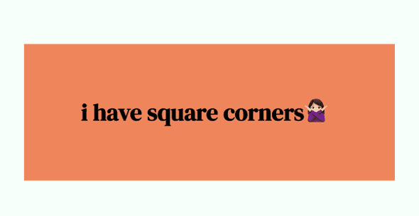
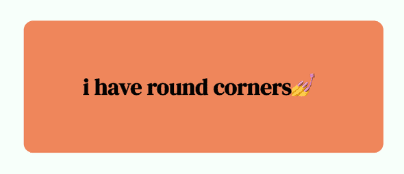
A word on border-radius
Depending on your design aesthetic, border-radius can be super helpful for softening edges and giving your elements a more relaxed feel. This is especially the case if there are already style choices being used that give your elements a visual edginess, like bright colours.
For the most part, border-radius will cover all your shaping needs. But — let’s be honest — round edges are not so impressive when you’re trying to show off some CSS skills.
So let’s take a look at what clip-path can actually do and how to create basically any shape.
What do you mean “any shape”?
You can turn your elements into *basically* any shape. I’ll leave it to you to push the limits of that.
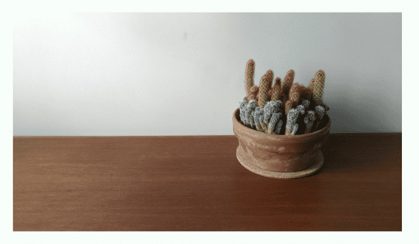
Take this photo of a cactus cluster from my living room, for example. It’s fine but it’s just the default rectangular shape, so let’s take it up a notch.
Let’s say we want to focus on the cactus itself. Without any photo editing, we can specifically show a circle shape and make the area outside the circle hidden with just one line of CSS styling:
    img {
        clip-path: circle(30% at 495px);
    }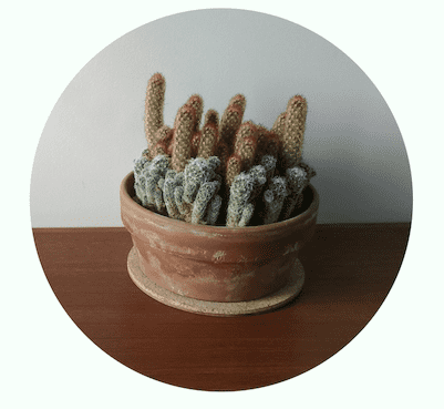
Note: the “at 495px” isn’t necessary; it just shifts the circle to the right 495px so the cactus is centred in the circle.
Now our image appears to be the shape of a circle and we haven’t had to edit the original photo at all.
Circles are fun but what else can clip-path do?
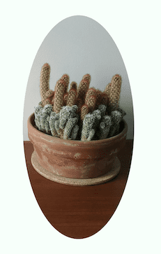
In this case “circle()” is a bit of a shortcut because the shape we make doesn’t actually have to have the same diameter all the way around. We can also use “ellipse()” instead to create a circle or oval shape. To create an oval, use this (but with values relevant to your photo):
    img {
        clip-path: ellipse(100px 200px at 493px 200px);
    }
Now let’s say you love a circle but you’re really more of a witchy dev who wants to show off your love of crystals and all things geometric. (I don’t know, just go with it.) You can create whatever polygon shape you want using the “polygon()” value, such as:
    img {
        clip-path: polygon(81% 0%, 88% 50%, 71% 98%, 33% 43%);
    }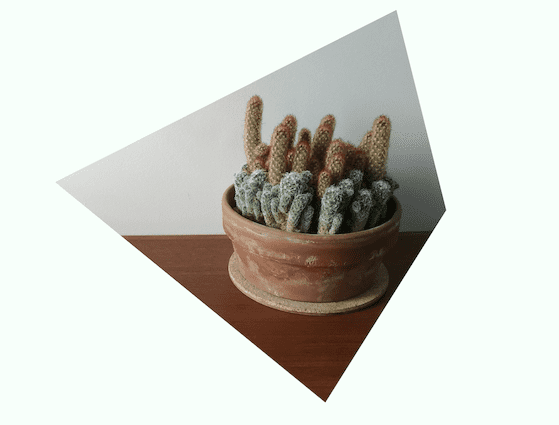
Starting from the top and moving clockwise, we can position the x- and y-coordinates of each of the four points to create a custom polygon of our choosing.
I chose a shape with four points but you can have more or less — totally up to you!
There are a lot more options for the value, plus styling SVGs, but you get the picture; pick your shape and then create it with the “circle()”, “ellipse()”, “polygon()”, etc. values.
In addition to shaping elements on your site, you can use clip-path to create shapes for background designs too. Let’s say you want to make your text’s backdrop a little more interesting, try something like this:
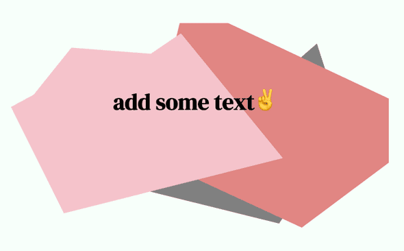
with this:
.shape {
    content: '';
    height: 65vh;
    width_: 90vw;
    left: 5vw;
    position: absolute;
    margin: auto;
    z-index: -1;
}

.shape1 {
    background-color: grey;
    clip-path: polygon(81% 10%, 88% 50%, 71% 98%, 36% 82%);
}

.shape2 {
    background-color: coral;
    clip-path: polygon(46% -10%, 114% 49%, 77% 100%, 36% 65%);
}

.shape3 {
    background-color: lightpink;
    clip-path: polygon(16% 12%, 37% 15%, 45% 5%, 72% 66%, 14% 93%, 0% 41%, 6% 35%);
}
Properties like clip-path are great because they’re a tool you can use for simple changes, or for getting super creative.
Okay, that’s cool, but what’s the cross-browser compatibility?
The short answer is it’s good enough (for my purposes at least!) Check out the full breakdown here but you can use it on all browsers other than IE and Edge.
For more details on all the different options for getting the shape you want, check out MDN’s documentation.
Happy coding! 🌿